Jack Dorsey and Evan Williams created the fledgling social networking site Twitter in 2005. They recognized the value of a logo to represent their invention. The creation of the first-ever Twitter logo signalled the start of a global social networking sensation. But once Elon Musk took control in 2022, the Twitter brand experienced swift and perplexing alterations, including platform adjustments, a disconnected new logo, and an odd redesign. Let’s now examine how the Twitter logo has changed throughout time.
History of the Twitter Logo

With its simple, beautiful form that appeals to people all over the globe, the Twitter logo has enormous relevance in the digital sphere and has made Twitter one of the most recognizable companies in existence right now. However, the development of the Twitter bird from its unassuming origins to the sleek image we today know illustrates the brand’s transformational path and long-term success.
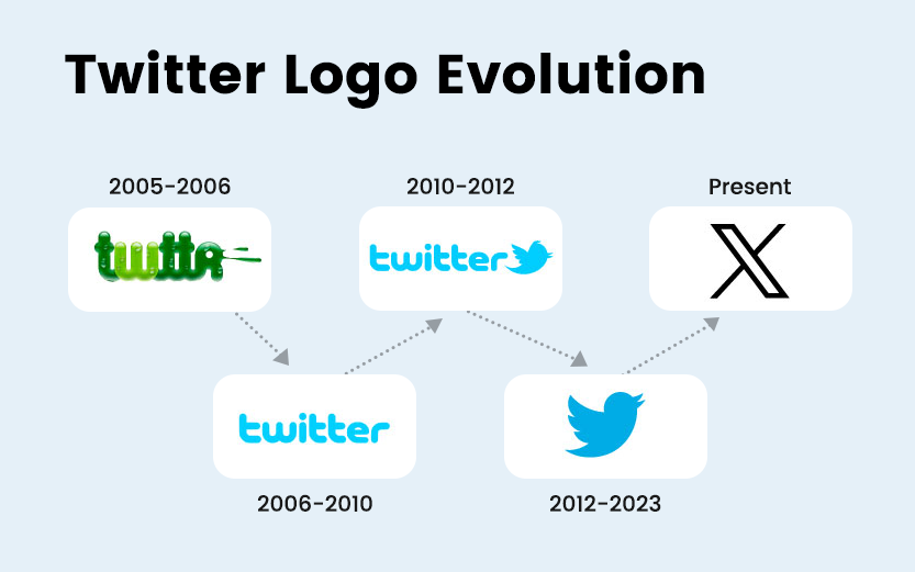
The launch of Twitter (2005-2006)

In 2006, Jack Dorsey, Biz Stone, and Evan Williams founded Twitter. The original Twitter logo differed greatly from the simple silhouette we now know. It was a slime-green wordmark spelling out “Twttr” in a bubbly font as a tribute to the brief SMS-style communications the site intended for.
Blue joins the conversation (2006-2010)

Twitter unveiled its first official logo to the public in 2006. It included a stunning sky-blue colour that would become the brand’s enduring colour for many years. Graphic designer Linda Gavin created the display typeface in only three days, reflecting the style of the 2000s and establishing the tone for the brand’s future. Initially, a simple bird image acquired from iStock for about $15 was used on many Twitter platform components, but it wasn’t until 2010 that it was included in the official logo.
First significant logo makeover (2010-2012)

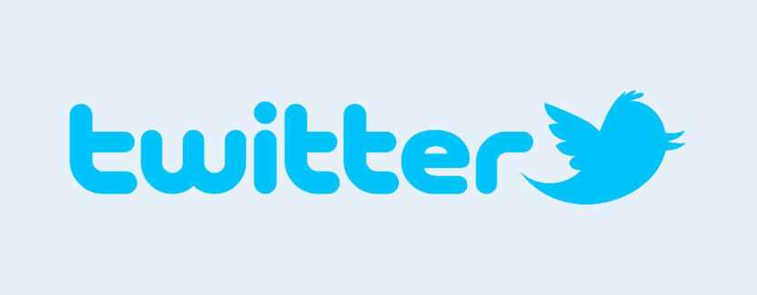
As part of a substantial rebranding effort in 2010, Twitter adopted the famous blue bird mascot, affectionately known as “Larry” after basketball legend Larry Bird, as a permanent feature of its design. Originally sporting a tuft of feathers on its head and wings ready for takeoff, Larry’s incorporation signaled a planned and comprehensive change in the brand’s identity. The ability to “Tweet” brief thoughts onto a digital stage and “retweet” the ideas and thoughts of users who are followed helped establish Larry’s status as Twitter’s feathered representative and solidified its role as a symbol of the platform’s core features.
The famous bird logo (2012-2023)

To emphasize Larry, the company’s mascot bird, rather than the wordmark, Twitter undertook a big logo makeover in 2012. The change included removing extraneous characteristics from the bird to leave a clean, basic silhouette that flew upward to represent Twitter’s dedication to clarity and freedom of expression. The simplified logo reflected Twitter users’ freeing sensation while using the platform’s character restriction of 280 to communicate their ideas by evoking a sense of limitless possibilities. The Twitter bird has stood the test of time by maintaining its timeless appeal and relevancy, demonstrating the brand’s continual design development. It represents Twitter’s development, journey, and commitment to providing a venue for deep dialogue and human relationships.
Twitter Rebrand by Elon Musk: X Logo (2023-present)

Elon Musk shocked the world on Monday, July 24, by saying goodbye to the famous blue Twitter bird and announcing a rebranding of the service as “X.” This action has caused worry, even though Musk’s prior rebranding of Twitter Inc. to X Corp in April was not wholly anticipated. The new emblem, which resembles a comic book villain, has drawn conflicting reactions, and the letter “X” itself connotes peril. To further curb spam, Twitter has instituted daily message limits for unverified accounts, encouraging users to subscribe to a service. Many people are dissatisfied with the branding since it diminishes the finest features of the once-beloved social networking site.
Psychology of colour
The original Twitter logo’s vivid light blue has many connotations, including communication, stability, and trust. It was a calculated move on Twitter’s part since the company wanted to build a community where people could express themselves freely and build trust.
Concerning the Twitter logo, Frequently Asked Questions.

How old was the original Twitter logo?
The initial Twitter logo was designed before the Twitter platform’s formal launch in 2005. The company’s first logo was the wordmark “Twitter” in a slime-green colour.

Why did Twitter’s logo change over time?
Over time, the Twitter logo changed from a wordmark to a simple bluebird. The brand’s recognition increased along with its worldwide expansion. After using a wordmark logo for many years, Twitter decided the brand’s relationship with the bird emblem was strong enough to exclude the business name entirely.

What does the Twitter bird’s presence in the logo mean?
The Boston Celtics’ three-time MVP winner Larry Bird inspired the name of the Twitter bird Larry. As a native Bostonian who linked the name Larry with brilliance, co-founder Biz Stone playfully named the Twitter bird after the all-star champion.

Does the Twitter logo have any hidden meanings?
The Twitter bird logo symbolized Twitter’s primary use case, which is to “tweet” ideas to the general audience, as well as freedom and possibilities. Twitter recently changed its logo to “X,” reflecting the modifications made to the platform to make it an “everything app.”
Why did Elon Musk change Twitter’s name?
Twitter CEO Linda Yaccarino unveiled the makeover as the first of many modifications to refocus the app. The updated “X” platform promises to act as a single center for payment and banking services and audio and video chat. Elon Musk wants “X” to develop into a worldwide concept, product, and service market. The growth of the Twitter logo represents how the company has grown from a simple messaging service to a global communication platform, signifying its journey, goal, and commitment to bringing people together worldwide. The Twitter logo captures the core of the company’s mission and objectives and goes beyond just being an emblem.
