For more than 60 years, Barbie has been a cherished part of childhood. The Barbie brand motivates Numerous young people to be imaginative, self-reliant, and unapologetic. We’ll examine how the Barbie logo has changed to represent fun, style, and creativity.
Since its creation in 1959, the enduring Barbie logo has undergone an amazing (and full circle) change. It is adapting to the present while always referencing its historical origins.
We’ll examine the key turning points in developing the Barbie logo and discuss how the brand identity and messaging have changed concurrently with the design.
A brief history of the Barbie logo

The first version (1959–1975): 1959, the first Barbie logo was unveiled. It had a delicate script type and a gentle pink colour scheme. Simple but effective!

Bold typeface introduction (1975–1991): A bolder, more modern font was used to update the brand. This was a major transition from the initial soft-script font to a typeface that projected a strong, contemporary identity.

Bold and contemporary (1991–1999): The Barbie logo was updated to reflect the decade’s tough design tendencies and to be harsher, bolder, and more contemporary. This represented the brand’s extensive history in the fashion sector. It demonstrated the Barbie doll collection’s expanding variety!

The original script’s comeback (1999–2004): The old script font of the Barbie emblem reappeared, although it was now angled like a signature. Combining the old with the modern honoured the brand’s lengthy history.

Y2K’s impact and flowering (2004–2005): During this brief revamp, the now-iconic bright pink colour was added along with a floral symbol above the letter “i.”

From 2005 to 2009, the Barbie logo was redesigned to emphasize simplicity and assertiveness. The design was simplified with a stronger typeface and a lack of extraneous features, indicating a desire for a more direct brand statement.

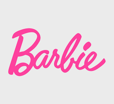
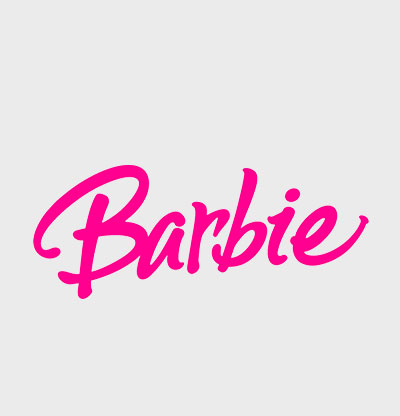
A classic is back (from 2009 to the present): The classic script type and soft pink colour scheme of the current Barbie emblem are reminiscent of the original 1959 version. This return to its beginnings is evidence of Barbie’s continuing appeal and continued cultural importance. Barbie history: The beginning of a legend.

Ruth Handler, a co-founder of Mattel who also invented the Barbie doll, developed the Barbie logo. To symbolize a lady with options, Ruth sought to design a toy. a lady who embodies powerful femininity, independence, and freedom—a change from the common baby dolls available on the market at the time.
She thus had the same aim when creating the Barbie logo! The classic display script type and the girlish pink hue of the Barbie emblem communicated both joy and the possibilities of the contemporary woman.
Barbie’s essence as a children’s toy that encouraged girls to dream of a future beyond the constricting 1950s gender stereotypes was successfully symbolized by this logo design.
Bild Lilli and Barbie

Did you know that Barbie’s origins may be traced back to post-war Germany? A German comic strip depicting paper dolls like Bild Lilli, eventually made into a novelty German doll, served as Ruth Handler’s inspiration. Lilli was an adult doll who, like Barbie, was stylish, independent, and focused on her career—quite a change at the time!
Did you know that Barbara Millicent Roberts is the full name of Barbie? The Barbie girl from Handler’s Daughter, Barbara, inspired the doll’s name. Her son Kenneth inspired the naming of Ken.
The evolution in the Barbie logo
Each stage of the growth of the Barbie logo, from the 1950s bright pink wordmark’s joyful modernism to today’s refined minimalism, flawlessly reflects the design trends and social movements of the period. Let’s start now!
1959 – 1975: the original “soft pink” Barbie logo with a script typeface
In 1959, the first Barbie logo was unveiled. It had a delicate script type and a gentle pink colour scheme. Together, these tasteful designs conveyed the glitz and refinement Ruth Handler had in mind for the company.

1975–1991: Change to a more assertive, contemporary logo
The Barbie logo had its first significant revamp in 1975, switching to a stronger, more contemporary typeface and adding a vivid pink shadow for a 3D effect. The goal of this revamp was to highlight the company’s close ties to the fashion industry and to represent the expanding diversity of the Barbie doll line.

1991–1999: Redesign with a contemporary new typeface
A makeover that marked a dramatic divergence from the previous Barbie emblems arrived in the 1990s. It’s more edgy, bold, and in line with the tough design fads of the 1990s. This modification highlighted the brand’s goal of embracing modern design trends to appeal to a larger target group.
The classic Barbie silhouette was first seen in 1999. It had a pink ponytailed silhouette that was left-facing. The original Barbie emblem and logo!
The Barbie doll line expanded and became more diverse over this period, reflecting the changing social mores and expectations of the day.

From 1999 until 2004, the original made a surprising comeback.
In 1999, the Barbie logo returned to the original script typeface but added a fun touch by angling it at a 45-degree angle to give it a more handwritten, individual appearance. Like a signature! The emblem also uses deeper pink, reflecting the period’s colour preferences.

2004 to 2005: The impact of Y2K and the flower
For a limited time, the Y2K style, which focused on futuristic and streamlined design aspects, impacted the Barbie logo. Including a five-petal flower above the letter “i” represented the brand’s transition to a more experimental stance.
The famous “Barbie Pink” was reinstated in this redesigned emblem but in a more vivid shade. After all, the year was 2000!
Bolder and simpler from 2005 to 2009
The Barbie logo had another change in 2005, emphasizing boldness and simplicity. The revised version dropped the floral element in favour of the traditional dot and focused more on the typography used in the prior logo. It expressed the brand’s goal for a more streamlined, classy, and less cartoonish emblem.
Barbie’s contemporary, self-assured, and energetic personality was expressed in the bright pink hue, enhancing its reputation as a company supporting femininity in all its manifestations.

2009 until the present: a classic is back
The new Barbie logo, used since 2009, carries over the 1959 original’s soft pink colour scheme and classic script typeface. This homage to the iconic brand is a salute to the Barbie doll’s lasting popularity and continued importance in the modern day.
It has symbolized a renowned company, doll, and emblem since the late 1950s.
iconic aspects of the Barbie emblem
Barbie’s pink as its logo colour
Since the brand’s founding, the unique Barbie pink hue has been essential to its identity. This hue of pink makes the logo stand out while evoking feelings of nostalgia and feminine charm.

Pantone’s Barbie pink shade: The Barbie Pink, also known as Pantone colour PMS 219 C, is a vivid, rich shade that immediately conjures images of Barbie. Due to its close association with Barbie, this hue is often called “Barbie Pink.” It is very important to the brand’s look and culture.
Did you know there was a global scarcity of pink paint due to the Barbie movie production?
Barbie’s typeface
The logo for Barbie uses what font? The Barbie emblem has consistently used elegant and sophisticated script typefaces in all its versions.
The font used in the Barbie logo is unique. It resembles a modified version of the Brush Script Std Medium font.
When technology advanced, the logo used serif typefaces with a handwritten look. However, the brand’s timeless and distinctive letter style brought comfort and recognition as time passed.
The many iterations of the Barbie logo
While the monogram has traditionally been the only part of the logo, other trademark elements have been used in various variations, including the famous Barbie silhouette, a star, a flower, and a Barbie logo in black and white.
While strengthening the identity and message of the Barbie brand, these symbols also provide intricacy and aesthetic intrigue.
The Barbie logo has stayed current for over six decades by remaining faithful to its origins while adjusting to changes. This flawless fusion of traditional and contemporary styles is proof of the company’s enduring appeal to the public. Young girls all around the globe are still inspired and delighted by its famous emblem.
Barbiecore is a style.

The Barbiecore style has been more popular in recent years because of the return of nostalgia for the 1990s and 2000s. So, this fashion fad is defined by an excess of pink, glitter, and Barbie-inspired clothing.
It honours the brand’s association with unabashed joy and glitzy femininity. It highlights Barbie’s trademark aesthetic’s long-lasting influence on societal and fashion trends.
Barbie: A universal icon and its influence
The Barbie emblem has transcended language borders and cemented itself in the collective awareness of the whole world thanks to its unique typeface and signature pink hue.
But this widespread acceptance is not a coincidence. The outcome of wise and strategic marketing choices and partnerships has kept the brand vibrant and current.
The Barbie emblem is often seen as a symbol of freedom, creativity, and empowerment.