1 ) Open Compositions: Ditch the Frames
2 ) 3D: Depth of a New Generation
3 ) Anti – Gravity: Flying & Floating Elements
4 ) Vivid Colors: Atrip to Dreamland
5 ) Metallic Effect
6 ) Fluid & Liquid Effect: Let it Flow!
7 ) Maxi Typography = Maxi Impact
8 ) Outline Typography
9 ) Text with Background: Retro Inspiration
10 ) Realism + Flat Design Elements
11 ) The Color of the Year
12 ) Alternative Art: Strokes, Stains & Doodles
01. Open Compositions: Ditch the Frames
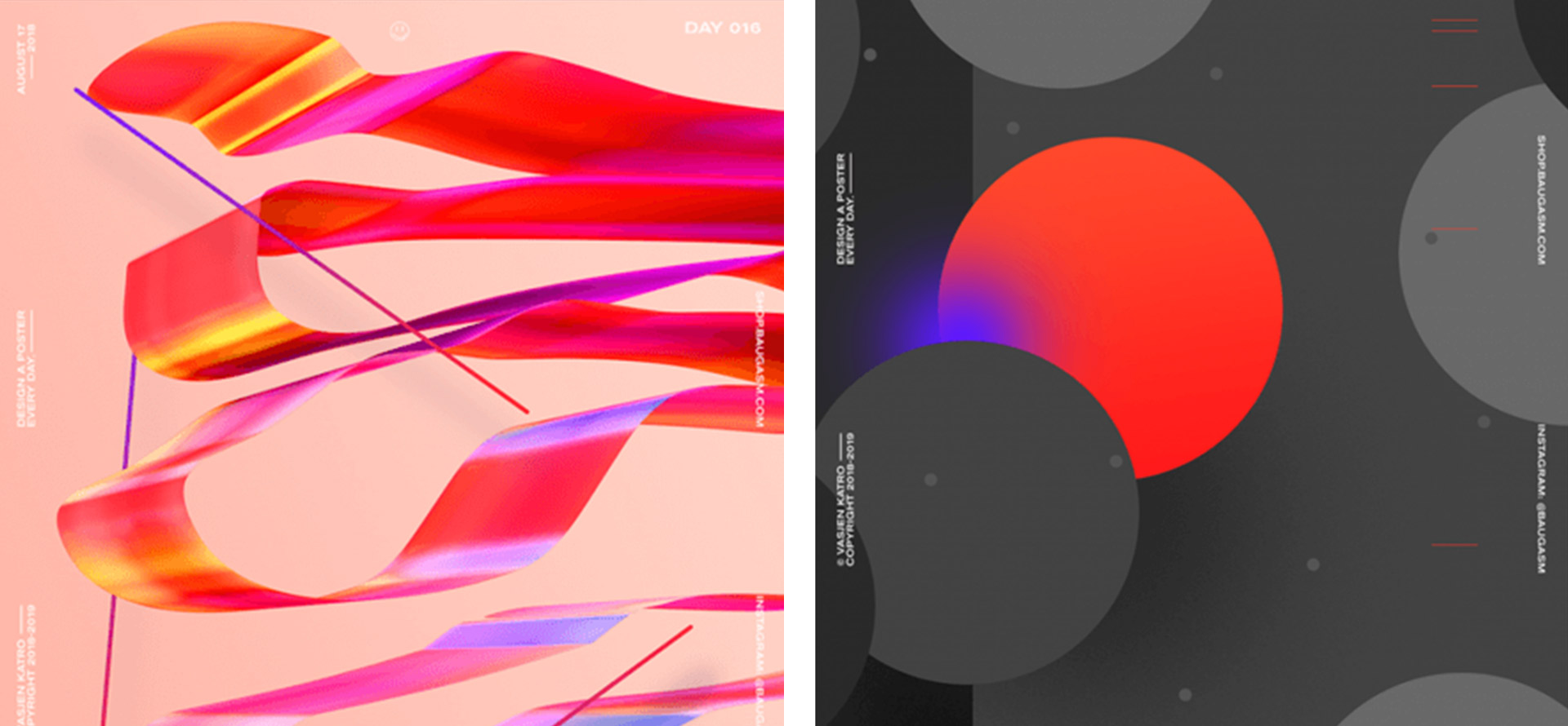
Graphic designers, you remember that old-aged design that put both frames visible and invisible on each thing to get the feeling of complete object design. Now that type of design transfers to another one that looks open from the whole object and shows only a glimpse of the whole picture.
Then the designers experimented with an open combination that ditches the frames. An open composition makes the viewer’s imagination a little more muscular, and that’s it. This open composition frequently shows clear elements and has a more chaotic look, for each element has been deliberately selected and placed.
02. 3D: Depth of a New Generation
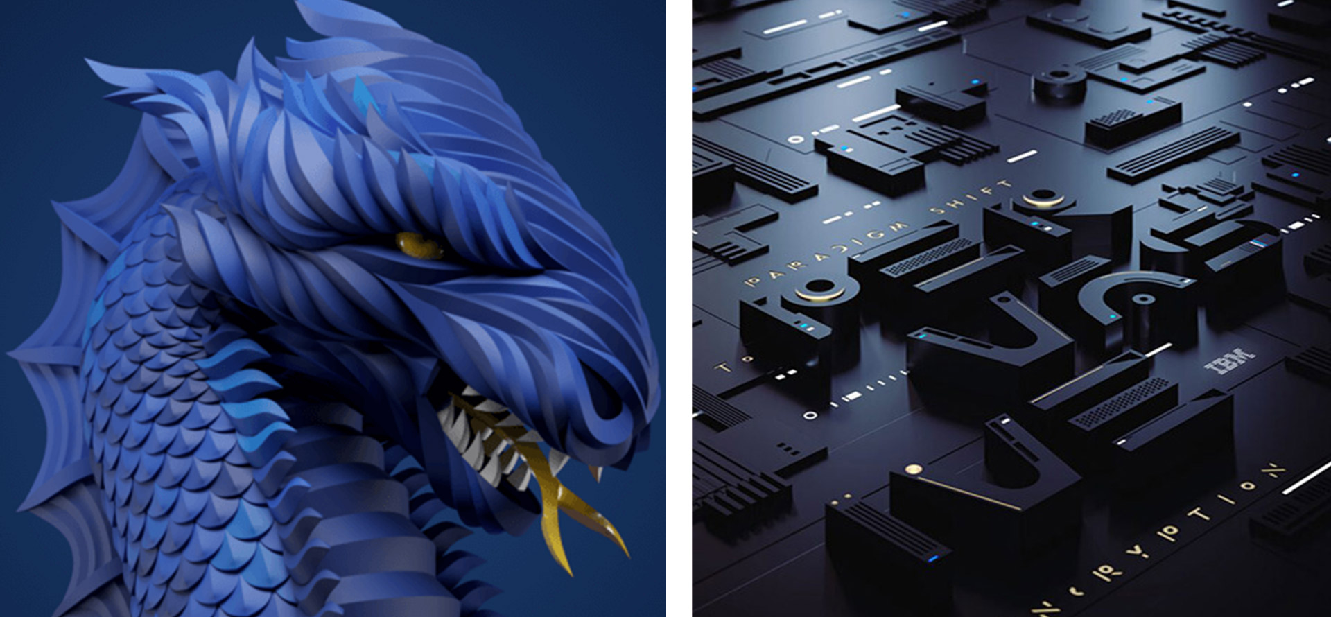
3D: Depth in graphic design makes your designs feel more catchy. The best part of this type of design is that all trends can be done in 3D, like a bold, skinny script or any font. The 3D design is a stable and trending design for the upcoming eras. And graphic designers are also well-trained to generate 3D design objects.
The 3D graphics, patterns, fonts, and objects give a real visual effect to any image or design. Using different 3D design elements to feel depth will make your design look more charming and attractive. The main reason for using 3D design is its eye-catching look, though adding depth to a design is a great option.
03. Anti-Gravity: Flying & Floating Elements
The time of flying and floating elements is known as an antigravity graphic design. The idea of designs that move and travel in environments like they are in antigravity and show the feel of freedom. The 3D design is also mixed up with the antigravity design concept, which adds to the composition’s visualization.
The visitors may easily understand the revolutionary when they look at this antigravity design, which naturally adds interest. As a result, an ordinary design turns into an extraordinary design. When floating in and out of the screen, these design elements create the concept of a window to the next level of branding.

04. Vivid Colors: Atrip to Dreamland
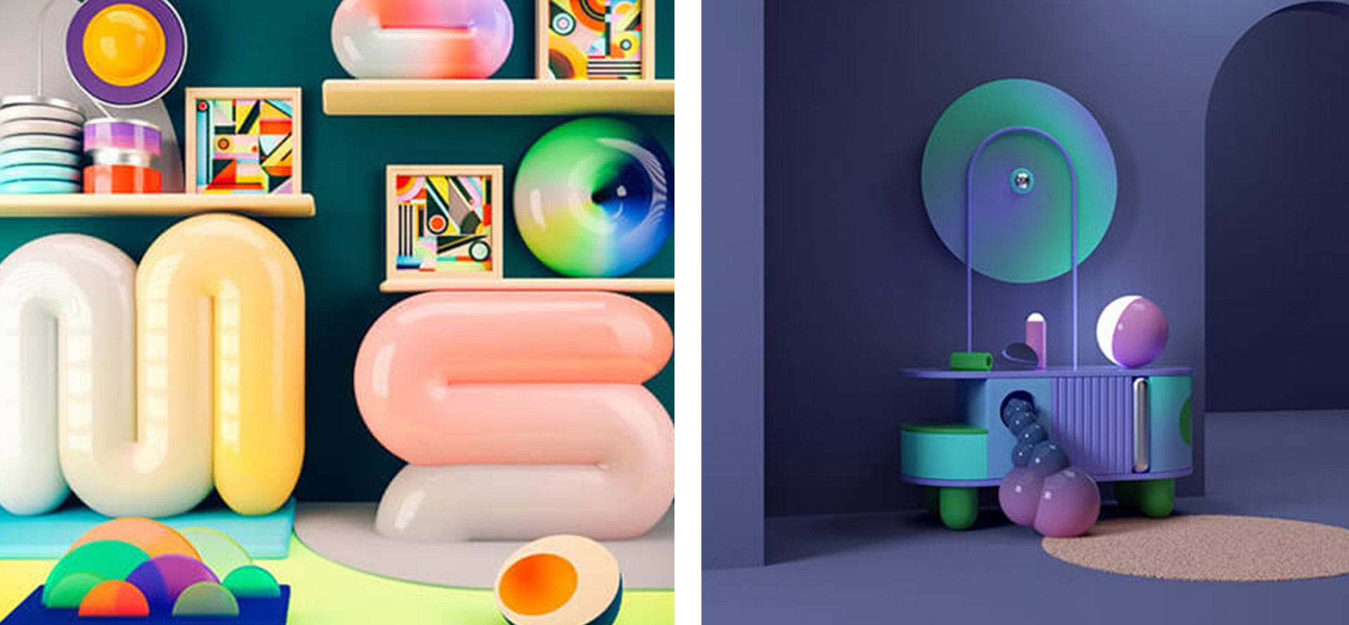
Vivid colors and a transition of dreamy color gradients will always be continued in trending. As they bring an advanced feeling to design, vivid colors will give you the perception that you are in another space.
Using advanced vivid colors to create charming designs takes the designer’s imagination to the next level. Many graphic designers use 3D visualization techniques with trending vivid colors to make attractive designs even better.
The 3D creativity and vivid color combination make a fabulous design when translated into a typography design. Typography in graphic design with vivid colors is a huge part to make its trends.
05. Metallic Effect
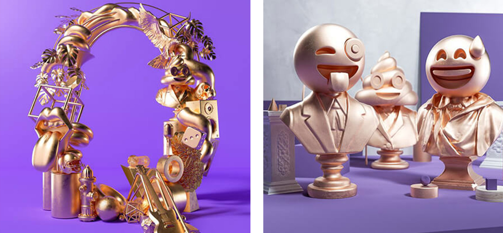
One of the graphic designer’s favorite trends is using metallic effects in design elements like text and icons. The metallic effect design is trending because of the use of metallic colors. You can make eye-catching creativity to attract people’s eyes to your design.
Regarding 3D design with metallic effect elements, your design will jump to an advanced level of creativity. Metallic colors like black and white combination will look fabulous in light shades. The golden color metallic effect is also well known for package designs.
06. Fluid & Liquid Effect: Let it Flow!
Fluid and liquid surfaces give you an effect by transferring liquid in design that may give you a chaotic feel and will go in a trend. It can be made with water, oil, paint, or other liquid material. The liquid effect gives you an extraordinary look regarding the typography.
Liquid has different properties like viscosity and thickness, but designers can quickly improve their designs with excellent liquid effects. The liquid effect design can create the feel of movements and smoothness. Liquid design can also be combined with suitable animation, bold color palettes, and gradients.

07. Maxi Typography = Maxi Impact
In graphic design, MAXI typography is such a bold and heavy text design that comes out on-page and takes to the center point. A combination of different font values and a combination of vertical and horizontal orientations with maxi typography will always look catchy.
Maxi typography becomes the focal point for most websites. When using maxi typography, make sure you don’t use 3D elements or gradients to make it more creative. Maxi typography is popular in designing logos, posters, websites, and package design.

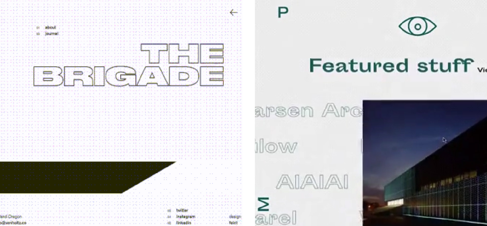
08. Outline Typography
Outline typography has made an exciting evolution into a graphic design trend. The graphic design trend will jump with outline typography when mixed with open composition and 3D elements.
Outline typography is more eye-catching, and they can better use white space on the website. It is more fun to use. In outline typography, letters can depart in background images and videos rapidly. So take care when you adjust color, contrast, and placement.
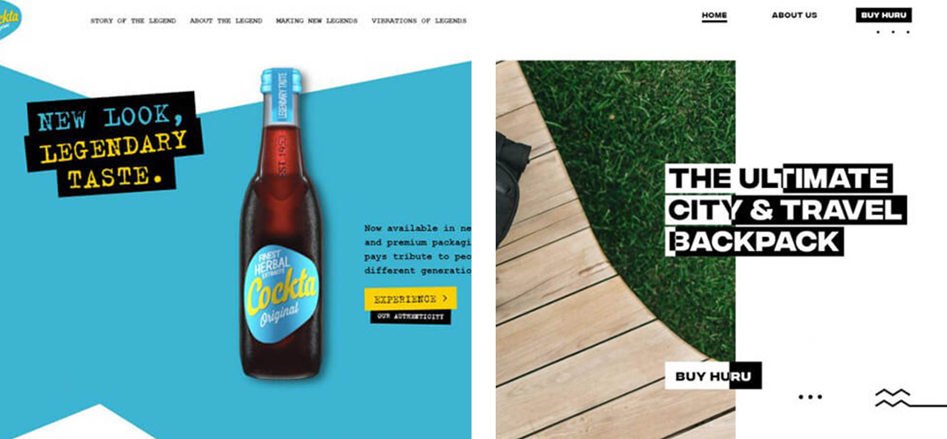
09. Text with Background: Retro Inspiration
A text with a background may look like a retro design, which may get a pickup in the upcoming graphic design trend. Text on the background looks eye catchy with a composition joined with other trends climbing the hill. Text with the background looks inspirational and reliable, a trend in the upcoming era.
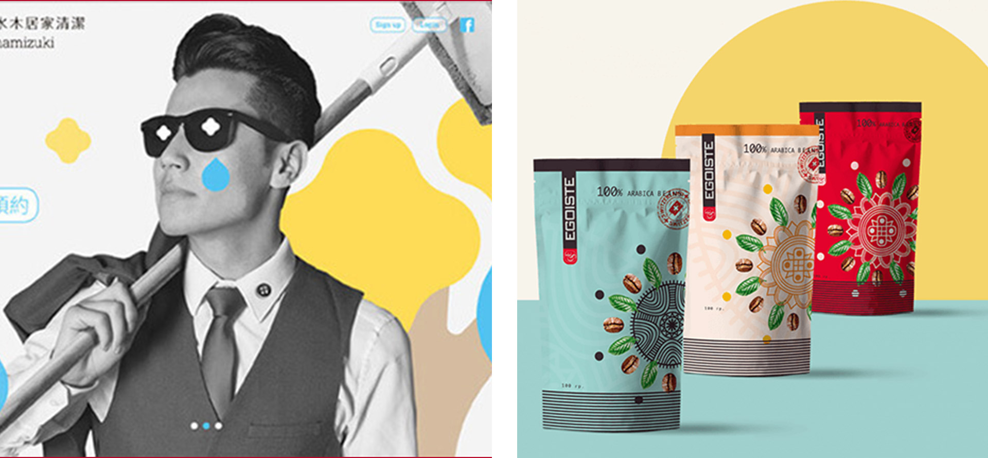
10. Realism + Flat Design Elements
There was a time when a flat design comes to the scene with a minimal look across the websites and devices. But now, in the upcoming time, graphic designers are evaluated with combine the flat design and realist elements to create a mirror look of their own new style.
As seen in web design, package design, and other types of graphic design, the combination of realistic elements and flat design makes very fabulous creativity, though the realism and flat design elements must go with the trend.
11. The Color of the Year
Every year, there is a color that inspires graphic designers to create unique designs in that particular color. At the end of every year, the color dictator declares the following year’s color. Then that color will be the first choice in every field, like graphic design, web design, package design, print design, and many more.

12. Alternative Art: Strokes, Stains & Doodles
We will see lots of improvement in alternative art styles in the future. The Doodles or freestyle designs are very fun to make and see in graphic design. Add some eye-catching strokes of color in freestyle art, and Doodle is enough to achieve fabulous design for any graphic designer.
These types of artwork and doodles will surely make an attraction to people. If a designer chooses the correct color strokes and unique elements to create artwork, that will go into the trend in the future.

