Top 10 Logo Design Trends
1) Animated Logos
2) Motion Black and White logos
3) Meaningful Letter Logos
4) Minimal Logos
5) Gradient Logos
6) Line Logos
7) Responsive Logos
8) Geometric Letters logos
9) Single Image Logos
10) Custom Type Logos
1. Animated Logos
An article is introduced to the role of an animated logo in branding. The animation logo design one of this year’s leading trends. Animated logos have become the first part of the powerful design. An animated logo is the most popular investment in marketing and brand awareness. Graphic designers turn static logos into something new and unique animation logos. Nowadays, many companies have started sharing their animated logos to promote their brands.
The animated logo presents the personality of a company or a product and plays a significant role in branding and digital marketing strategies. To bring a fresh breath into the logo, design experts decided to add some animation logos to their gallery. Today the tools helping to create animated graphics are in open access to use, so graphic designers often create animation on their own. An animated logo is the latest and trending way to present a brand.

2. Motion Black and White logos
Motion black and white logos represent a lack of color. Motion black and white logos will never go out of trend. They are classic, smooth, don’t distract, and work with every design. Motion black and white logo strongly impacts your target audience and draws attention to your brand. Motion Black and white logos are influential and trustworthy because black and white logos can show solid emotions, and too much can be catching.
Here is the best motion black and white logo brand example to inspire you:

3. Meaningful Letter Logos
Meaningful letter logos show your brand’s value with a custom letter logo designed just for you by a professional graphic designer. Meaningful letter logos cover your brand’s name in just one word that represents your brand name and brand value worldwide. Meaningful letter logos are very simple to understand, but very difficult and complicated to design.
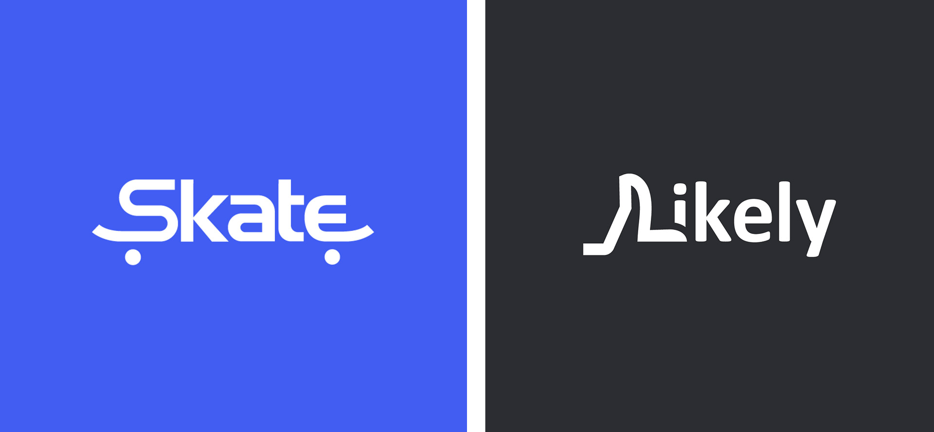
Here is the best meaningful letter logo example to inspire you:
As shown in this meaningful letter logo, a graphic designer Mihai Dolganiuc describes the brand name SKATE using the simple and meaningful letter logo.

4. Minimal Logos
Minimalism can be difficult to achieve when it comes to logo design. If finalized improperly, the minimal logo may look too simple or boring. Minimal logo designs are an excellent choice for businesses in the fashion and technology industry that want a mess-up-free logo for a modern brand in the present day. Minimal logos of any brand can be easier for their customers to remember, too.
You can also design a minimal logo using good form and negative space, That may go a long way toward creating a strong and trending visual impression on any brand logo.By focusing on only the necessity, you can create a stunning minimal logo design that is eye-catching and classic.

5. Gradient Logos
Colorful gradient logos have faded out in between and have begun their latest trends. Adding some unique gradient effects onto the simple logo will look great and will surely make the logo unique compared to others, which shows the power of gradient logos. You can also use a gradient logo design that fades from one color into transparent, and that’s it. Gradients should be used to design a strong logo, not a weak one. Instagram, Firefox and Tinder…what present all of these brands have in common? A colourful and unique gradient logo design. For an appropriate target audience, these types of gradient logo designs can make a powerful impact.

6. Line Logos
Line logos are very simple and minimal logo designs created with abstract line art that’s looking so sober. Line logos are most popular for child care, travel agency, photography, boutique, and many more businesses. Line logos are the basis of typography, drawing, and illustration. Their elemental nature can be applied to basic ideas, so if you are trying to capture a concept that typography logos or anything else that alone can’t spell out, this is a good place to start.

7. Responsive Logos
Have you heard of responsive logos? This is the latest trend for corporate identity to get fit for today. In a world where device screens come in all sizes and shapes, getting content cannot just mean scaling up or down. Instead, we need logos that can make elegant and efficient use of any screen space and may fit in that space.
If a logo design is effective, your customers will recognize it from any element. Then the concept of responsive logo design begins.

8. Geometric Letters logos
From circles to squares to complex logo designs, geometric letter logos are popular. They can express a range of emotions through their mathematical precision and letter design. Squares and rectangle-shaped logos show solid and stable. In contrast, a circular and oval logo design can give higher efficiency to any big brand.
Geometric letter logos go well with their basic shapes to tell more about any brand story. Good graphic designers understood how geometric letters, shapes, and patterns can give a visual direction to communicate bid ideas about any brand’s logo design.

9. Single Image Logos
Single-image logos are very popular because these types of logos look strong online. A graphic Designer creates this awesome logo design by using different gradient colors to make shadows and combining with clever use of angles that related to any brand.

10. Custom Type Logos
Custom-type logos exist for a reason. They make easier work as a graphic designer because when a client needs any specific types of elements, and they need some specific type of design, then custom-type logos come to the place. Some big brands are making their logos with customization and they use their own elements in that particular custom logo design.

